
What are the most famous paintings of famous painters?
I drive a tram in Adelaide, South Australia. The route runs from the city out to Glenelg and back, and on my rest days I walk in the other direction, into the Art Gallery of South Australia with a pocket notebook. It started five years ago when a split shift left me two free hours and a free gallery next door. I sat on a bench, looked at a small Dutch interior, forgot my phone for twenty minutes, and kept coming back.
I am not an art historian, a critic, or a teacher. I am a hobbyist who sketches wobbly copies of masterpieces and reads the wall label last. What I write here is for other ordinary visitors, the kind of people who enjoy museums and famous paintings but feel they know nothing about art. If that is you, pull up a chair. If you already feel lost in a gallery, read a guide to feeling less lost first.
Readers searching for paintings of famous painters usually want the same thing I wanted on that first afternoon: names, images, and a reason to care. So I picked 15 paintings that turn up again and again in books, museums and conversations. I should be honest. My home gallery owns none of them. I have seen only a few in person. I know most from books, screens and the small copy sketches in my notebook, so I look at them differently from a painting I can stand in front of. This is a hobbyist’s shortlist, not a scholar’s ranking.
I will focus on how to look at each painting, what to notice first, and why it is still talked about in 2026. Not auction prices, not trivia. The range runs from Renaissance to modern art, covering portraits, landscapes, religious scenes and abstraction, like a mini tour of Western painting history. Art history includes works that defined eras and captured the human condition, and these fifteen do that in different ways. Significant artistic movements appear here: Renaissance, Baroque, Romanticism, Impressionism and Surrealism all get a seat.
The structure: how I chose, a ranked list with “why it stands out,” “best for,” strengths and limitations, a quick comparison, and a guide to choosing what to look at first.
Why These Specific Paintings of Famous Painters Matter
Famous paintings often reflect personal emotions and societal contexts. Some sit in palaces, some in purpose-built museums, and a few hang in churches where the light still falls the way the artist planned. What they share is staying power. They keep showing up on tote bags and in arguments and on classroom walls because each one solved a visual problem or named a feeling that nobody could put into words before. That is why they matter, and that is why this page exists.
How I Chose These Famous Paintings
I treated the art world like a comparison list with too many candidates. Only some are useful as a beginner’s mental “starter gallery.” I limited myself to individual paintings by already famous painters, 15 in total, not series or movements.
Core Criteria I Used
Here is what I looked for:
-
Recognisability. Would a stranger on my tram know the image? Does it turn up on mugs, tote bags and tea towels? The Mona Lisa and Starry Night pass this test without effort.
-
Availability. Can you see it in a major public gallery like the Louvre, the Uffizi, the Rijksmuseum, the Prado, MoMA or the Belvedere?
-
Art history impact. Did it shift something in painting? The High Renaissance is characterized by mastery of sfumato and strict linear perspective. Impressionism focuses on light and atmosphere in painting. These are turning points, and I wanted paintings near them.
-
Clarity for beginners. Does it reward a first look but have deeper layers on return?
-
Variety. A mix of periods, countries, subjects and styles, so the list is not all Italian Renaissance or all Impressionists.
-
Personal experience. Did it teach me something when I tried to copy a corner of it in my notebook? Note that fame is not quality, and I do not claim these are the “best” ever made.
What I Deliberately Left Out
A few notes on what is missing and why:
-
I left out some equally famous paintings to keep the list focused. I chose Girl with a Pearl Earring over another Johannes Vermeer to avoid repetition.
-
I skipped works famous mainly for their theft or price tag rather than their usefulness to someone learning to look. Salvador Dali’s The Persistence of Memory challenges concepts of time through surreal imagery, and Surrealism explores dreamlike imagery and the subconscious mind, but I had to draw a line somewhere.
-
I avoided more than one painting per artist unless dropping it would distort the story of painting too much.
-
Raphael’s The School of Athens represents Renaissance humanism and intellectual culture, and Caspar David Friedrich’s Wanderer Above the Sea of Fog depicts solitude and the sublime aspect of nature, but both fell outside my final fifteen.
-
This is not “the 15 greatest of all time.” It is a practical starter set that fits on an imaginary gallery wall in the reader’s head.
The 15 Essential Paintings of Famous Painters for Curious Gallery Visitors
I roughly rank these by how often they come up for beginners and how much they changed painting, not by my favourites. Each entry covers what it is, why it stands out, who it suits, strengths and honest limitations.
1. Leonardo da Vinci, Mona Lisa (c. 1503 to 1506, Louvre, Paris)
Leonardo da Vinci painted the Mona Lisa around 1503, and it is smaller than most people expect. The woman’s half-smile has turned into a symbol of “art” itself. The Mona Lisa redefined portraiture with its enigmatic smile, and it became a celebrity image after the 1911 theft from the Louvre. The Mona Lisa entry on Wikipedia gives a useful timeline of its history.
Why it stands out. Leonardo da Vinci’s sfumato technique blends colors subtly, creating soft transitions of light across her face. There are almost no hard outlines. My sketch showed how soft the edges are: my pencil kept wanting a line where Leonardo had none. The quiet background landscape recedes through atmospheric perspective, and the whole oil painting sits in a balanced triangular composition.
Best for. First-time Louvre visitors who want to understand the fuss, and readers who enjoy slow looking at faces over dramatic action.
Key strengths. Psychological depth, light modelling that hides brushstrokes, and a composition that holds your attention without shouting.
Possible limitations. It can feel like a logo instead of a person, and thick glass, distance and crowds in Paris make real looking hard.
2. Vincent van Gogh, The Starry Night (1889, Museum of Modern Art, New York)
Vincent van Gogh created The Starry Night in 1889, painting a swirling night sky over a small village from the asylum at Saint-Remy. Starry Night reflects Van Gogh’s emotional turmoil and longing for peace. You can see the museum’s own record on the collection page for The Starry Night.
Why it stands out. Vincent van Gogh used energetic brushwork to convey emotion, and the intense blues and yellows turn a landscape into an emotional weather report. Post-Impressionism features bold colors and emotional expression in art, and this canvas is one of the movement’s landmarks. Copying a patch of sky taught me the swirls are short, separate strokes laid side by side, a pattern of marks, not one smooth swirl. Notable techniques in art include chiaroscuro and impasto brushwork, and Van Gogh’s thick, visible paint layers are a textbook case of impasto.
Best for. Viewers who respond to colour and movement, and beginners who think “I don’t get old art” until they see post-Impressionist colour.
Key strengths. A memorable rhythm across the sky, a bold limited palette that reads from across the room, and clear feeling without any background story. The emotional impact hits before you read a single word on the wall.
Possible limitations. It is so widely reproduced that the original surprises, and interpretation can drift into myth about Van Gogh’s illness instead of close looking.
3. Johannes Vermeer, Girl with a Pearl Earring (c. 1665, Mauritshuis, The Hague)
A young woman turning toward us in a blue and yellow turban and a large pearl earring. Girl with a Pearl Earring is renowned for its luminous rendering of light and expression.
Why it stands out. The mix of intimacy and distance, minimal background and crisp light on fabric and skin. It is the “Dutch Mona Lisa,” with a mystery around the sitter. It is technically a tronie, a character study, not a portrait of a named sitter. The pearl’s highlight is a couple of touches of paint, and my copy showed how little it takes to suggest a shiny object.
Best for. Readers who like one quiet moment over a complex narrative, and people learning to notice light on faces.
Key strengths. A simple composition focused on face and earring, controlled light, and a timeless feel from the dark background.
Possible limitations. Little narrative can feel “empty,” and heavy marketing makes it seem like a brand.
4. Michelangelo, The Creation of Adam (c. 1508 to 1512, Sistine Chapel, Vatican City)
The Sistine Chapel ceiling fresco whose near-touching hands of God and Adam are among the most quoted images in Western art. The human figure here carries a huge religious idea through one gesture.
Why it stands out. The tension between the two fingers, the sculptural bodies and a huge story told in one gesture, within the larger Sistine program and influencing countless later images.
Best for. Visitors planning a first trip to Rome, and readers interested in how painting, anatomy and theology meet.
Key strengths. An unforgettable gesture, the body as expressive form, and a structure that reads from a distance.
Possible limitations. Crowds, time limits and surrounding imagery make viewing hard, and reproductions crop to the hands, hiding the larger scheme.
5. Rembrandt, The Night Watch (1642, Rijksmuseum, Amsterdam)
A large group portrait of a city militia company, full of motion and famous for dramatic lighting. Rembrandt van Rijn lived from 1606 to 1669 and is a key figure of the Baroque art movement. The Night Watch showcases Rembrandt’s mastery of light and shadow.
Why it stands out. Rembrandt turned a static group into a moving scene and used light like a stage director. Chiaroscuro emphasizes contrast between light and shadow, and this painting is one of its greatest demonstrations. The Dutch Golden Age is known for dramatic chiaroscuro and domestic realism, and this piece sits right at the heart of that era. The thing I look for is the light: a few figures lit strongly and the rest sinking into shadow. Copying one face taught me how much a painter decides to leave dark.
Best for. Viewers who like to get lost in big canvases with hidden stories, and readers curious about chiaroscuro.
Key strengths. A complex yet readable composition, rich textures in fabric, metal and faces, and spotlighting that guides the eye.
Possible limitations. Its size and crowds mean you must step far back, and the militia and civic context may need a short explanation.
6. Sandro Botticelli, The Birth of Venus (c. 1485, Uffizi Gallery, Florence)
Venus on a shell, blown toward shore by wind gods, one of the most recognised mythological images of the Renaissance.
Why it stands out. A linear, almost graphic style and pale colours that revived ancient mythology in a Christian city, influencing later idealised images of the female nude. What struck me is how flat and graceful the figures are, more like a drawing in colour than a window into a room.
Best for. Readers curious about Renaissance Florence and the return of pagan stories, and fans of graceful line over strong realism.
Key strengths. Elegant drawing and flowing hair and drapery, a clear narrative, and a central figure that shaped beauty ideals.
Possible limitations. The idealised body and symbolism can feel remote, and a crowded gallery with rival masterpieces makes slow looking difficult.
7. Claude Monet, Impression, Sunrise (1872, Musee Marmottan Monet, Paris)
A hazy orange sunrise over Le Havre harbour, the painting that gave Impressionism its name. Impressionism emerged through Claude Monet’s interest in changing light.
Why it stands out. Sketchy strokes and visible colour patches broke with academic finish. Prominent characteristics of Impressionism include capturing fleeting light and colors, and this artwork is the movement’s birth certificate. Critics mocked it as “Impressionist” after the 1874 exhibition, and the name stuck. Impressionism emphasizes visible brushstrokes and outdoor painting. Claude Monet painted over 1300 works during his lifetime, and his Water Lilies series alone includes over 250 paintings. Copying a bit of water showed me he often used a few warm and cool colours together instead of one “water colour.” Georges Seurat later developed the Pointillist technique for color balance, pushing the same interest in light even further.
Best for. Visitors curious where modern painting began, and hobby painters who like working from life.
Key strengths. Strong contrast of blue-grey water and orange sun, loose handling that still reads as boats and reflections, and a manifesto role for Impressionism.
Possible limitations. It can look “unfinished,” and reproductions boost the colours so the original seems quieter.
8. Pablo Picasso, Guernica (1937, Museo Reina Sofia, Madrid)
A huge black-and-white mural of the bombing of the Basque town of Guernica during the Spanish Civil War. Pablo Picasso was born in 1881 and died in 1973, and Guernica by Picasso delivers a powerful anti-war message. He also created Les Demoiselles d’Avignon, another piece that cracked open new ways of seeing.
Why it stands out. Cubism breaks subjects into geometric forms and offers multiple viewpoints, and those fractured shapes fill this canvas alongside newspaper-like monochrome and a raw anti-war message. Its travelling history made it a political and artistic icon, and it now lives in Madrid. It is not a pretty picture and is not meant to be, but the way the shapes crowd together is something I keep coming back to.
Best for. Readers interested in how modern art handles war and suffering, and visitors ready to stand before one painting for minutes, tracing figures.
Key strengths. Overwhelming scale, inventive fragmentation to express chaos, and significance tied to real events.
Possible limitations. Overlapping figures are hard to read at first, and distance from the 1937 context needs a short explanation.
9. Edvard Munch, The Scream (1893, National Museum, Oslo)
A figure on a bridge holding its head and screaming under a blood-red sky.
Why it stands out. A direct picture of anxiety where line and colour twist reality to match emotion. Edvard Munch created several versions in different materials, but the central image is shorthand for modern fear, now visible in cartoons and emojis. I like it because the background does as much work as the face.
Best for. Viewers who like artwork that names hard-to-voice emotions, and readers interested in expressionist distortion.
Key strengths. Immediately legible emotion, flowing lines against a turbulent sky, and a compact, memorable composition.
Possible limitations. Memes can make the original feel less serious, and the intensity may be uncomfortable.
10. Gustav Klimt, The Kiss (1907 to 1908, Belvedere, Vienna)
A couple in an embrace, wrapped in a gold patterned cloak near a flowered edge.
Why it stands out. Shimmering gold and decoration against tender faces and hands, from Gustav Klimt’s “Golden Period” and an icon of Viennese art around 1900. The gold-leaf background and patterned robes make the couple a single glowing shape. My notebook version was mostly squares and circles.
Best for. Viewers who love rich decoration and romantic subjects, and people curious about the bridge from symbolism to modern design.
Key strengths. A luxurious surface, a simple central motif that reads in reproduction, and a dreamlike mix of intimacy and stylisation.
Possible limitations. Souvenir overexposure blunts its impact, and the reflective gold is tricky to see evenly or photograph.
11. Diego Velazquez, Las Meninas (1656, Prado Museum, Madrid)
A large interior with the Infanta Margarita, her attendants, a dog and the painter himself at work, tangled in reflections and viewpoints.
Why it stands out. The puzzle of who is looking at whom, the mirror at the back, and a challenge to the viewer’s role, as a painting about painting that influenced later painters and thinkers. I have spent a whole afternoon on a reproduction of it, which tells you how well it rewards slow looking. Realism here is not just copying nature but questioning what we see.
Best for. Readers who enjoy visual puzzles, and visitors willing to step back and move sideways.
Key strengths. Natural light and lifelike flesh tones, a balanced complex arrangement, and new details on every visit.
Possible limitations. It can feel confusing or crowded, and works best with a little knowledge of court life and portrait traditions.
12. Caravaggio, The Calling of Saint Matthew (c. 1599 to 1600, San Luigi dei Francesi, Rome)
Christ, cloaked in shadow, extends his hand to a tax collector at a dim table, lit like a stage play. This is my personal favourite on the list. The Baroque era is characterized by dramatic use of light and shadow, and Caravaggio took that principle further than anyone.
Why it stands out. Dramatic light, ordinary models in biblical stories, and a gesture echoing Michelangelo’s Creation, pushing Baroque painting toward gritty realism and theatre. A beam of light crosses a dim room and lands on the tax collector, and everything turns on that beam. For a closer breakdown, read about what Caravaggio’s Matthew scene shows. If you want the story behind the scene, read what the Matthew painting depicts.
Best for. Visitors to Rome who will see it in its original chapel lit from the side, and readers curious how light alone tells you where to look.
Key strengths. Sharp contrast of bright figures and deep shadow, a cinematic moment of decision, and contemporary clothing that pulls an old story into Caravaggio’s present.
Possible limitations. The chapel is dim and crowded, and the religious subject needs plain-terms explanation for some viewers.
13. Grant Wood, American Gothic (1930, Art Institute of Chicago)
A stern farmer with a pitchfork and a woman, standing before a white house with a pointed Gothic window.
Why it stands out. Crisp, slightly stylised realism and an icon of rural America in the Great Depression, with endless parodies and debate over whether it mocks or honours its subjects.
Best for. Readers interested in national identity and stereotypes, and Chicago visitors linking it to other American modern works.
Key strengths. A symmetrical composition with the pitchfork echoing the window, faces readable in several ways, and a clear sense of place and time.
Possible limitations. Parodies can make the original feel less serious, and some see only regional Americana.
14. Wassily Kandinsky, Composition VIII (1923, Solomon R. Guggenheim Museum, New York)
A network of circles, lines, angles and colour patches on a light background, a key abstract painting.
Why it stands out. Wassily Kandinsky believed colour and shape could act like music, expressing feeling without depicting objects. The piece sits between early abstraction and later geometric movements like Constructivism. Artists like Paul Klee, Henri Matisse, Paul Gauguin and Georgia O’Keeffe were all, in their own ways, pushing at the edges of what a painting could capture, but Kandinsky went furthest from the visible world.
Best for. Readers willing to give pure form and colour a chance, and visitors who feel lost in front of abstract works in New York or elsewhere.
Key strengths. A dynamic balance of lines and circles, non-representational but ordered, and a good gateway into abstract art.
Possible limitations. Viewers who insist on stories may be frustrated, and poor reproductions dull the colour and flatten it.
15. Kazimir Malevich, Black Square (1915, State Tretyakov Gallery, Moscow)
A black square on a white ground, sometimes cracked with age, presented as a radical “zero point” of painting.
Why it stands out. Its shocking simplicity in 1915 and its declaration that painting could abandon objects, influencing Minimalism, conceptual art and debates about what art is.
Best for. Readers curious about the far edge of modern art and why some paintings look “like nothing,” and people who like big questions over pretty pictures.
Key strengths. Conceptual clarity as a deliberate reduction, historic shock value that still echoes, and a prompt to discuss surface and material.
Possible limitations. Viewers may dismiss it as a joke without historical context, and it needs more explanation than any other painting here.
Quick Comparison of These Famous Paintings
For readers who want a fast way to find where to start, here are the fifteen grouped by mood:
-
Faces and quiet looking. Mona Lisa and Girl with a Pearl Earring, for subtle expression and light on skin.
-
Colour and mood. The Starry Night, Impression, Sunrise, The Scream and The Kiss, for brushwork, colour, emotion and pattern.
-
Big stories and drama. The Creation of Adam, The Night Watch, The Calling of Saint Matthew and Guernica, for gesture, crowds, dramatic light and war.
-
Myth, puzzles and identity. The Birth of Venus, Las Meninas and American Gothic, for ideal beauty, paintings that break the “fourth wall” and national stereotype.
-
Abstraction. Composition VIII and Black Square, for easing into abstract art and debating what painting is.
How to Choose Which Famous Paintings to Focus On
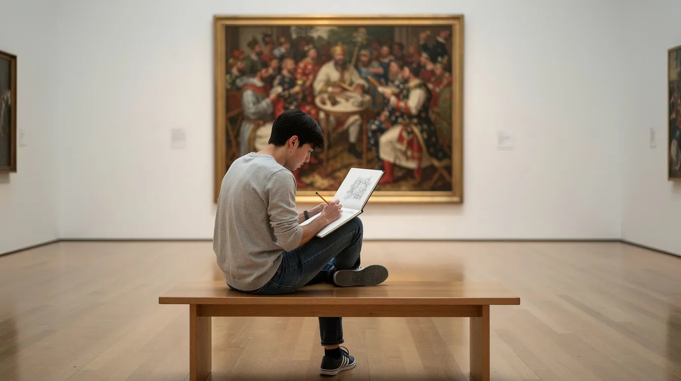
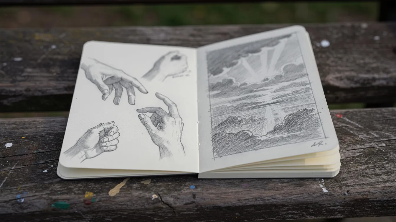
No one absorbs all 15 in one museum trip or evening with a book. Pick a smaller personal “starter set” based on stories, faces, places or pure colour and form. Here is the routine I use in front of any picture: give it one full minute before reading the label, find the brightest spot and ask why it is there, then sketch one small corner, even badly, because drawing forces you to notice what you skip. A still life, a hand, a glimpse of sky will do.
Choose Based on the Stories You Like
If you love myths, Bible stories or history, start with The Creation of Adam, The Calling of Saint Matthew, Las Meninas, Guernica and American Gothic. These works repay a little background reading and then pay it back with richer viewing. Jot the main story in a notebook after you look, and it will stick.
Choose Based on How Comfortable You Are with Style
Think of a sliding path from realistic to abstract and place yourself on it. Realism lovers should start with Girl with a Pearl Earring, Mona Lisa and The Night Watch. Open-minded beginners can try one realist, one Impressionist like Impression, Sunrise or The Starry Night, and one early modern work like The Kiss or American Gothic. If you are already curious about abstraction, point yourself at Composition VIII and Black Square as a deliberate challenge.
Choose Based on Where You Might Actually Travel
Match the list to real museum trips. If you are planning Paris, focus on the Mona Lisa and Impression, Sunrise. Heading to New York, study The Starry Night and Composition VIII in reproduction first. Madrid means Guernica and Las Meninas. This is how I work from Adelaide: far from the big European museums, I study from books and screens and keep a “to-see in person” list in a notebook, checking works off over years. It keeps the collection growing slowly in my head, leaving me with something to look forward to on every day off.
Which Paintings Are Best for You Right Now?
-
Choose the Mona Lisa to see why one small portrait became the symbol of “fine art,” or Girl with a Pearl Earring if you prefer quiet, intimate pictures over busy scenes.
-
Choose The Starry Night if colour pulls you in, or The Night Watch if you love big, cinematic images full of detail.
-
Choose Guernica if you care how art answers real-world violence, or Composition VIII if you are ready for abstraction but want order.
Pick no more than three for a first deep dive. Continue with the rest later. You will find you remember them better when you take your time.
Final Thoughts: Building Your Own Mental Gallery of Famous Paintings
There is no single “best” famous painting. There are only paintings that are best for particular questions, moods and stages of learning. Some of my best afternoons have been in front of works nobody has put on a mug, paintings that caught me off guard because I had no expectations. This list is a starting view, not the whole view.
Feeling small or confused in front of a masterpiece is normal. Learning to look is like learning a tram route: the first few runs feel unfamiliar, and then one day you notice the way the light hits the water at a certain stop, and you wonder how you missed it before. Repetition makes it familiar. If galleries still feel intimidating, start the way I did: find a free one, sit on a bench, and give one original painting ten minutes instead of ten paintings one minute each. You can also read more on how to feel less lost in a gallery.
Treat this list as a conversation starter, not a course syllabus. The next time you see one of these fifteen in a news photo, film or meme, pause, recall one detail from this page, and look a little longer. That is all looking takes.
FAQ
What is the most famous painting in the world? Most would say the Mona Lisa, with The Starry Night and The Scream as strong runners-up for image recognition.
Which painter has the most famous paintings? It depends how you count, but Van Gogh, Picasso, Monet and Rembrandt each have several works almost everyone has seen. Van Gogh is the name I hear most from people who say they know nothing about art.
Can I see these paintings in one place? No. They are spread across museums in many cities, and some, like The Calling of Saint Matthew, are in churches. Museum websites and good book reproductions are a way to study them first.
Do I need to know art history to enjoy them? No. I started with no background and a free gallery during a split shift. Slow looking and sketching a corner will get you further than memorising dates.
Is a copy sketch worth doing if I cannot draw? Yes. My copies are rough, and the point is to look closely, not to make something worth framing.